How to properly offer your Compose mobile apps more rendering freedom by enabling edge-to-edge mode, and then how to deal with the gotchas. In this article we’ll be looking at my attempt at a Material3 UI in Compose Multiplatform, the issues I faced, and the workarounds I ended up using to overcome them.
NOTE: While the code in this article is focused around Compose multiplatform, the bulk of the workarounds and attention are towards the Android side.
Motivation #
The sane defaults of an Android app give you a safe area to render yourself in, which is great, but doesn’t look as good as it could. Let’s visualize the difference! Take a look at the following example:
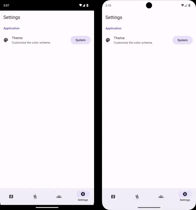
Default (Left) vs. Edge-To-Edge (Right)
To me, the edge-to-edge feels more modern, the UI blends in with the rest of the phone, shows off the actual screen size of the device, and doesn’t look like a rectangular cutout. It will look even nicer if you leverage some M3 designs like color fading of the top app bar on scroll and so on.
Speaking of M3, another design goal for this application is to have in-app theme selection.
Basic Setup #
I will try not to go too much into detail, but rather give you the short and sweet, and point you into the right direction so that you can go more in depth at your own pace. I assume you have your basic project already set up.
Configuring iOS #
It’s rather straightforward to enable edge-to-edge on the iOS side, you simply need to ignore the safe areas on your Compose view from SwiftUI, and let Compose manage insets itself, which we will learn shortly.
struct ContentView: View {
    var body: some View {
        ComposeView().ignoresSafeArea(.all)
    }
}
Configuring Android #
Android is a bit more complicated.
Let’s start with some AndroidManifest.xml boilerplate.
Since Compose is very reactive, it knows how to handle configuration changes via its composition local providers.
Most of that is done under-the-hood for you.
But we would like to prevent the activity from recreating itself on said configuration changes1, so we need to add some things to our manifest :
<activity
    android:name=".MainActivity"
    android:configChanges="orientation|screenSize|screenLayout|keyboardHidden|mnc|colorMode|density|fontScale|fontWeightAdjustment|keyboard|layoutDirection|locale|mcc|navigation|smallestScreenSize|touchscreen|uiMode"
    android:exported="true"
    android:windowSoftInputMode="adjustResize">
    <intent-filter>
        <action android:name="android.intent.action.MAIN" />
        <category android:name="android.intent.category.LAUNCHER" />
    </intent-filter>
</activity>
By setting the configChanges property to that very long string of options, we basically say the following:
“I am capable of handling all of these types of configuration changes on my own, don’t recreate my activity, just
notify me.”
While we are here, since the whole point of enabling edge-to-edge is to be able to manage insets ourselves, we should
also set the windowSoftInputMode 2.
This will allow us to receive the size of software IME (here: keyboard) as insets as well.
Then, similar to iOS, there is one line of code we must add in our boilerplate to enable edge-to-edge mode.
In your MainActivity:
class MainActivity : ComponentActivity() {
    override fun onCreate(savedInstanceState: Bundle?) {
        super.onCreate(savedInstanceState)
        enableEdgeToEdge()

        setContent { App() }
    }
}
Configuring Compose #
That was all the platform-specific setup (…for now! Hey, foreshadowing!). Now as you write your composable UI, you will notice you might render behind the system UI. This is to be expected, since enabling edge-to-edge mode means we are responsible for handling the insets ourselves.
If you are using Material3 components, many of the default layout components automatically handle insets for you: Scaffolds, Sheets, and the various AppBars.
But, if you find yourself making a custom layout, or simply pop a top-level Box or Column for a simple screen, here
is how you can add the insets yourself.
It’s actually delightfully simple:
@Composable
fun MyContent() {
    Column(
        modifier = Modifier
            .fillMaxSize()
            .verticalScroll(rememberScrollState())
            .safeContentPadding(), // <- Handle insets.
        verticalArrangement = Arrangement.Center,
        horizontalAlignment = Alignment.CenterHorizontally,
    ) {
        // ...
    }
}
You can set insets using modifiers.
There are various methods that let you fine tune what you want to inset: systemBarsPadding(), safeGesturesPadding(),
imePadding(), and more.
Discover them with intellisense!
Theming #
Now that we have the project configured, we can look at how to enable theming support for our app.
System-Responsive Theme #
The first step would be to simply make the app theme follow the system light / dark mode. You can find countless articles on the topic, but the gist of it is we create our theme wrapper as a composable close to the top of our composition hierarchy:
@Composable
fun AppTheme(
    darkMode: Boolean = isSystemInDarkTheme(),
    content: @Composable () -> Unit,
) {
    MaterialTheme(
        colorScheme = if(darkMode) DarkColorScheme else LightColorScheme,
        content = content,
    )
}

private val DarkColorScheme = darkColorScheme()
private val LightColorScheme = lightColorScheme()
We then hook it up to our App composable:
@Composable
fun App() {
    KoinContext {
        AppTheme {
            Surface(
                modifier = Modifier.fillMaxSize(),
                color = MaterialTheme.colorScheme.background,
            ) {
                Navigator(MyScreen())
            }
        }
    }
}
Note that in this example we use Koin and Voyager, though
it’s not really relevant to our scope, it’s just here to offer a better idea of how the real-case scenario
bootstrapping code might look like.
What we care about is the bit about the MaterialTheme local provider working, and seeing the proper background
color in our app.
In-App Theme Switcher #
We also want to give the user the ability to select a different theme inside the app and override any system defaults. In this example we will be having four modes (but you can easily expand it to have named custom colored themes): ‘Follow the System’, ‘Always Light’, ‘Always Dark’, ‘Material You’.
First, let’s define an enum for the available themes. The dark variant property will make sense later:
/**
 * The predefined theme names.
 * @property darkVariant Whether the theme is a dark theme or a light one.
 *                       If `null`, it's either and follows the system setting.
 */
enum class AppTheme(val darkVariant: Boolean? = null) {
    System,
    Light(false),
    Dark(true),
    MaterialYou;
}
To persist this across app launches, we need some sort of service. Since the app is Kotlin Multiplatform, I will be using multiplatform-settings, but you may explore other solutions. “Here’s an example, just a little sample”:
@Single(createdAtStart = true)
class ThemeService(private val settings: FlowSettings, platform: Platform) {
    private val coroutineScope = CoroutineScope(
        context = SupervisorJob() + Dispatchers.Default + CoroutineName("ThemeService")
    )

    val theme: StateFlow<AppTheme> =
        settings
            .getStringFlow("theme", defaultValue = AppTheme.System.name)
            .map { theme -> AppTheme.entries.firstOrNull { it.name == theme } ?: AppTheme.System }
            .stateIn(coroutineScope, SharingStarted.Eagerly, AppTheme.System)

    fun setTheme(theme: AppTheme) {
        coroutineScope.launch {
            settings.putString("theme", theme.name)
        }
    }

    val themeOptions: Set<AppTheme> = AppTheme.entries.toSet().run {
        if (platform == Platform.Android) this else minus(AppTheme.MaterialYou)
    }
}
Notice we make this service responsible for the list of allowed values, as to not present the Material You entry when
not on the Android platform.
We also need to implement an expect / actual for getting the color scheme for that one:
/**
 * Returns a material you color scheme, or `null` if not on the Android target.
 * @param darkVariant Whether to return the dark variant of the theme.
 */
@Composable
@ReadOnlyComposable
expect fun materialYouColorScheme(darkVariant: Boolean): ColorScheme?

// Android
@Composable
@ReadOnlyComposable
actual fun materialYouColorScheme(darkVariant: Boolean): ColorScheme? =
    if (darkVariant) dynamicDarkColorScheme(LocalContext.current)
    else dynamicLightColorScheme(LocalContext.current)

// iOS
@Composable
@ReadOnlyComposable
actual fun materialYouColorScheme(darkVariant: Boolean): ColorScheme? = null
We now can create a mapping from the theme enum to a color scheme (up to you if you want to provide a fallback for missing Material You color scheme or not):
/** Returns the [ColorScheme] associated with this [AppTheme]. */
@Composable
@ReadOnlyComposable
private fun AppTheme.colorScheme(systemDark: Boolean): ColorScheme = when (this) {
    Light -> LightColorScheme
    Dark -> DarkColorScheme
    System -> if (systemDark) DarkColorScheme else LightColorScheme
    MaterialYou -> materialYouColorScheme(systemDark)!!
}
And finally, let’s integrate it into our theme wrapper:
@Composable
fun AppTheme(
    darkMode: Boolean = isSystemInDarkTheme(),
    content: @Composable () -> Unit,
) {
    val appTheme: AppTheme by koinInject<ThemeService>().theme.collectAsState()

    MaterialTheme(
        colorScheme = appTheme.colorScheme(darkMode),
        content = content,
    )
}
Then you can also make some UI to update the preferred theme, left as an exercise to the reader 😉.
Gotcha! #
In a perfect world, bugs like these would not exist. But this is not a perfect world, this is a MAD world.
Now, I could just skip to the fix, but this is a perfect opportunity for learning!
Encountering First Gotcha #
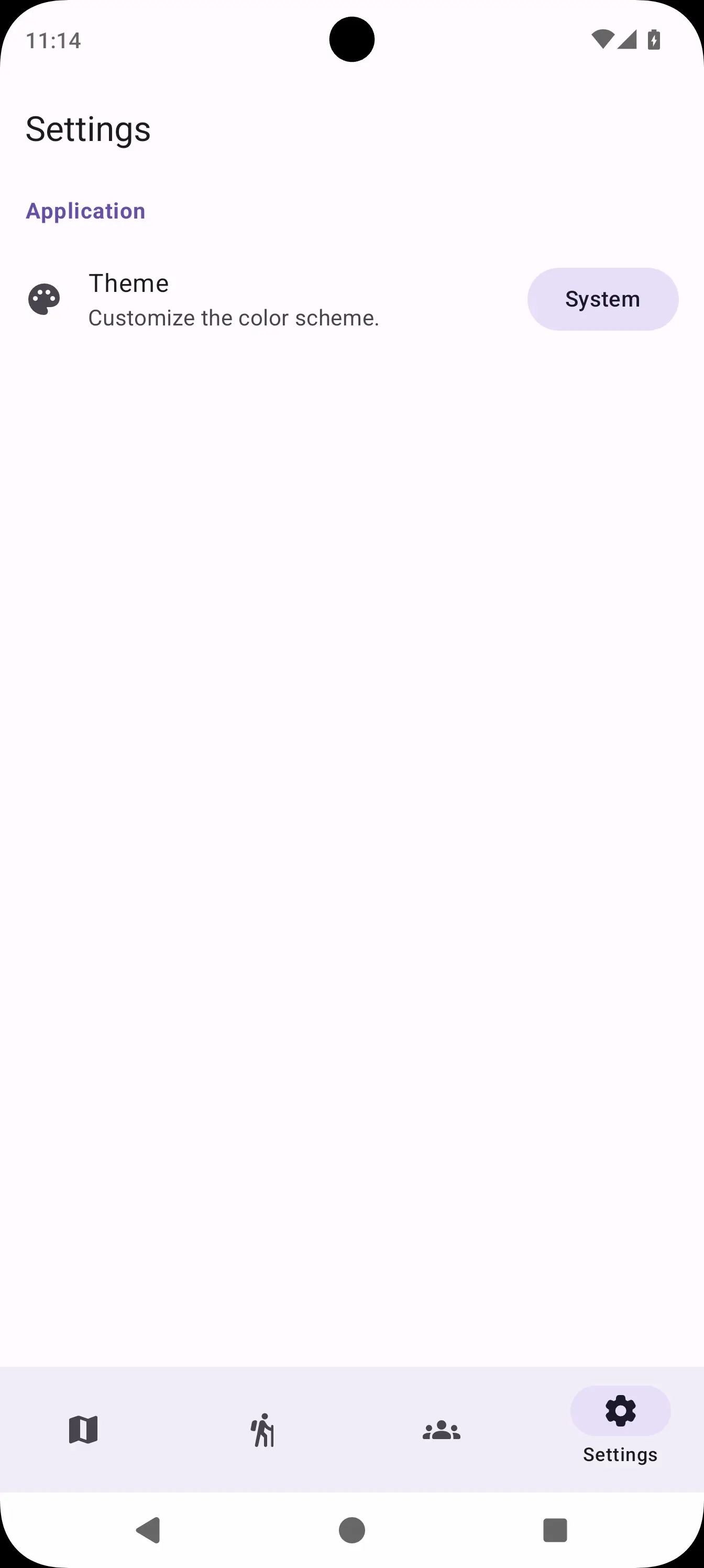
If you launch the app now, it will look good. Then you play around to see if your material theme is reactive, and you may be able to spot it:
Notice how we are missing the system bar icons and clock when we switch to night mode. Why?
Well, it’s because the code for enableEdgeToEdge checks for the current system theme, at the time of activity
creation.
We already established we will not be recreated when a configuration change (like the change in dark mode) occurs.
So the system bar still thinks we are on a light theme, and continues to use dark colors for the content.
If you launch the app with dark mode enabled, you will have the opposite problem: you won’t see the white text once you
switch to light mode.
Fixing First Gotcha #
The fix for this is relatively simple.
We need to react to configuration changes and update the bar accordingly.
We can do so by overriding the onConfigurationChanged method:
class MainActivity : ComponentActivity() {

    override fun onCreate(savedInstanceState: Bundle?) {
        super.onCreate(savedInstanceState)
        isDarkMode = resources.configuration.isNightModeActive
        enableEdgeToEdge(transparentBarStyle, transparentBarStyle)

        setContent { App() }
    }

    private var isDarkMode = false
    private val transparentBarStyle = SystemBarStyle.auto(
        lightScrim = Color.TRANSPARENT,
        darkScrim = Color.TRANSPARENT,
        detectDarkMode = { isDarkMode },
    )

    override fun onConfigurationChanged(newConfig: Configuration) {
        super.onConfigurationChanged(newConfig)
        if (isDarkMode != newConfig.isNightModeActive) {
            isDarkMode = newConfig.isNightModeActive
            enableEdgeToEdge(transparentBarStyle, transparentBarStyle)
        }
    }
}
We also hold a state over if the app is in dark mode or not, and only change when required. We can now recompile and see it working:
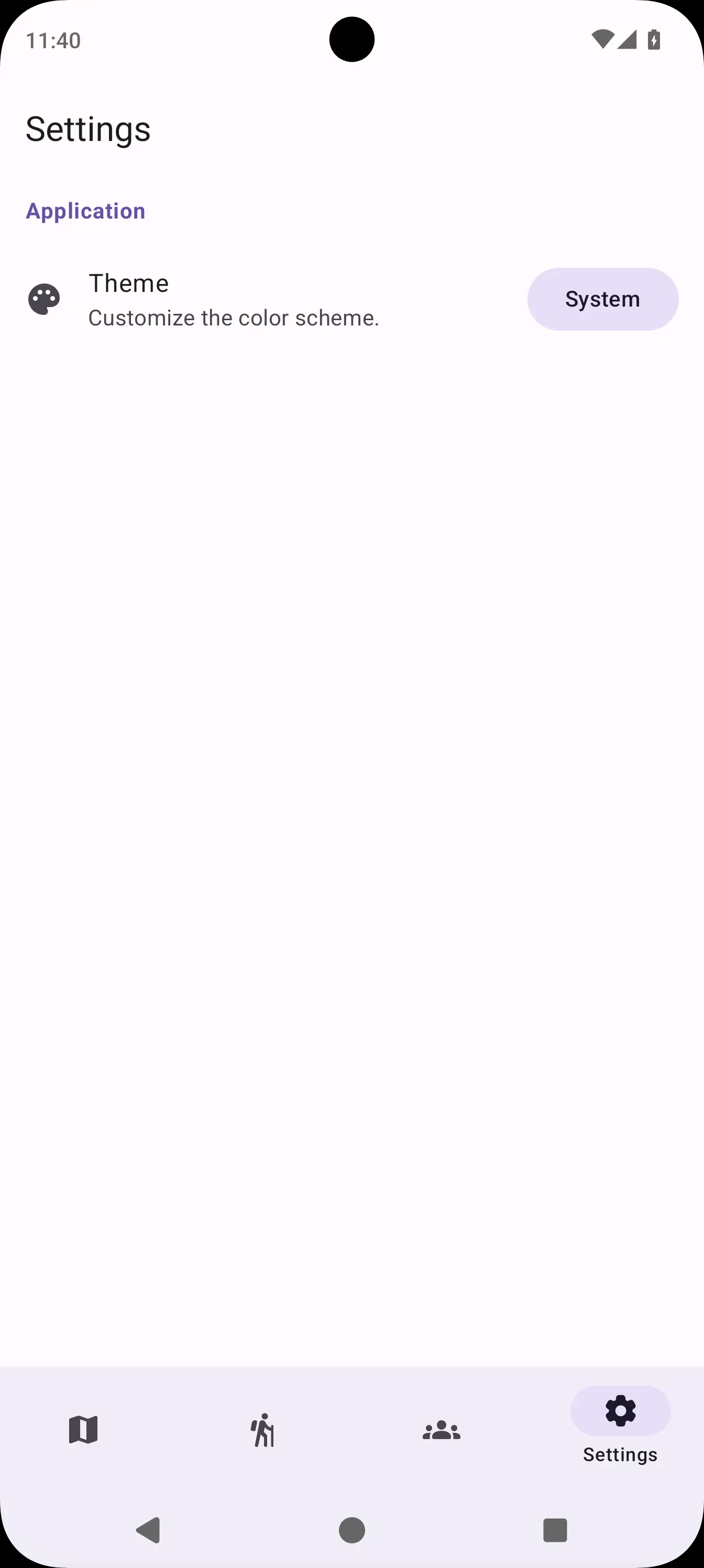
Encountering Second Gotcha #
You now run again but to your dismay you spot it, you didn’t quite fix it yet:
Since the system bar follows the system theme, and not the app theme, we still have the contrast issue when the system is in dark mode but the app uses the light theme and vice-versa.
Fixing Second Gotcha #
To fix this, we need to slightly tweak our workaround to also listen for theme preference changes.
class MainActivity : ComponentActivity() {

    private val themeService by inject<ThemeService>()

    override fun onCreate(savedInstanceState: Bundle?) {
        super.onCreate(savedInstanceState)
        updateEdgeToEdge(forceUpdate = true)

        // Observe changes.
        themeService
            .theme
            .onEach { updateEdgeToEdge() }
            .launchIn(lifecycleScope)

        setContent { App() }
    }

    private var isDarkMode = false
    private val transparentBarStyle = SystemBarStyle.auto(
        lightScrim = Color.TRANSPARENT,
        darkScrim = Color.TRANSPARENT,
        detectDarkMode = { isDarkMode },
    )

    override fun onConfigurationChanged(newConfig: Configuration) {
        super.onConfigurationChanged(newConfig)
        updateEdgeToEdge()
    }

    private fun updateEdgeToEdge(forceUpdate: Boolean = false) {
        val oldDarkMode = isDarkMode
        // The custom theme has precedence over system.
        isDarkMode = themeService.theme.value.darkVariant ?: resources.configuration.isNightModeActive
        if (forceUpdate || oldDarkMode != isDarkMode) {
            enableEdgeToEdge(transparentBarStyle, transparentBarStyle)
        }
    }
}
We extract the update in a separate function, and call it either on a configuration change, or when the theme changes. And now, finally, we have a complete working solution.
Encountering Gotcha 3 #
Or so we thought. But then we try using the app without gesture navigation and we see this:
When using button-style navigation, there seems to be a scrim applied seemingly out of nowhere. Ugh…
Fixing Gotcha 3 #
This is caused by our use of SystemBarStyle.auto without RTFM, which states:
On API level 29 and above, the bar will be transparent in the gesture navigation mode. If this is used for the navigation bar, it will have the scrim automatically applied by the system in the 3-button navigation mode. Note that neither of the specified colors are used. If you really want a custom color on these API levels, use dark or light.
So, we need to slightly change our code:
private fun updateEdgeToEdge(forceUpdate: Boolean = false) {
    val oldDarkMode = isDarkMode
    isDarkMode = themeService.theme.value.darkVariant
        ?: resources.configuration.isNightModeActive
    if (forceUpdate || oldDarkMode != isDarkMode) {
        val transparentBarStyle =
            if (isDarkMode) SystemBarStyle.dark(Color.TRANSPARENT)
            else SystemBarStyle.light(Color.TRANSPARENT, Color.TRANSPARENT)

        enableEdgeToEdge(transparentBarStyle, transparentBarStyle)
    }
}
It works again! Beauty!
Imagining Gotcha 4 #
We had some success, but now imagine that the UI we make doesn’t have the usual top and bottom app bars, or that they auto-hide when scrolling through content.
It might be the case that scrollable content, especially images, would still mess up the contrast with the system bar icons being a static color.
Avoiding Gotcha 4 #
I can’t even begin to describe the voo-doo fix we might need to work around that in the current state of system bars in Android, which were simply not designed to be used this way, so we will Occam’s Razor it.
If we simply design our app to always display bottom and top bars, we won’t run into the issue. Not ideal, but custom code could be written to mitigate it, such as a bar that doesn’t fully collapse when scrolling such as to provide our own skim, or even giving up on the transparent skims and swap them with uglier, translucent ones.
Bonus Round: Compose All The Way #
If the whole MainActivity boilerplate seems too old-school and hacky, there is a cleaner way to do it in Compose only.
We can define the following helper (again, the iOS variant should be a simple NOOP).
@Composable
internal expect fun UpdateEdgeToEdge(darkVariant: Boolean)

// Android
@Composable
internal actual fun UpdateEdgeToEdge(darkVariant: Boolean) {
    val view = LocalView.current
    if (view.isInEditMode) return

    SideEffect {
        val barStyle =
            if (darkVariant) SystemBarStyle.dark(Color.TRANSPARENT)
            else SystemBarStyle.light(Color.TRANSPARENT, Color.TRANSPARENT)
        (view.context as ComponentActivity).enableEdgeToEdge(barStyle, barStyle)
    }
}

// iOS
@Composable
internal actual fun UpdateEdgeToEdge(darkVariant: Boolean) = Unit
And simply call it in your AppTheme:
@Composable
fun AppTheme(
    darkMode: Boolean = isSystemInDarkTheme(),
    content: @Composable () -> Unit,
) {
    val appTheme: AppTheme by koinInject<ThemeService>().theme.collectAsState()

    // Add side effect:
    UpdateEdgeToEdge(appTheme.darkVariant ?: darkMode)

    MaterialTheme(
        colorScheme = appTheme.colorScheme(darkMode),
        content = content,
    )
}
This works because a configuration change will force a recomposition, and we do react to changes in themes because we collect it as state, so we only need to call the side effect once, in a single place.
No Gotchas on iOS? #
I will preface this with the HUGE disclaimer that I didn’t build my app for iOS to test it myself because I do not
own a personal macOS device (yet).
However, it appears that the problems of status bar contrast should not be a thing on iOS, since the default
UIStatusBarStyle3 dynamically adjusts itself to ensure proper contrast with the contents below it (check out an
example in this SO post).
Come On Google! #
Come on Google, you can do it too! Actually, wait just a second! Look at the gesture indicator bar thing in the previous videos. It behaves exactly like the iOS dynamically contrasting bar styles.
To better illustrate, I have forced the opposite contrast skims:
Not only does it know to contrast with the color, and not the dark mode toggle, it also dynamically adjusts itself when sliding the notification area on top of it.
The tech is there, but as far as I am aware there is no way of enabling this behavior on the status bar as well. Please Google, can I haz dynamically contrasting status bars? 🥺👉👈
Conclusion #
This was a high-level overview on how I implemented an edge-to-edge render mode in a Compose Multiplatform application with custom material theme preferences. It may not be perfect, and there are still gotchas, but it gets the job done for now.
Hopefully in the future we will have better integration with system-specific stuff on Android so that we don’t have to do these sort of workarounds ourselves.